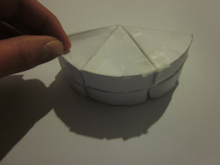
These are the final photos of my finished model. I chose to do them in black and white so it wouldn't take away from the contrasting pattern.
Thursday, 11 August 2011
Final 200 word description
I chose to work with sight as my main sense for this interactive project. I wanted to create an object that was visually pleasing to the user and had a movement that contributed to the overall visual effect. I chose a bold mono-chromatic pattern that I believe draws the user in and encourages them to continue to play and manipulate the object to continue seeing the pattern move. I wanted something that didn’t take much concentration to use but at the same time had a mesmerizing affect. The object also allows different shapes to be formed when the corresponding sides are matched up and folds up into a cube. I have kept my craft simple and chose to only use paper and tape as I found that these were the most successful materials for this project. I hope that overall I have created an object that hold peoples attention and gives a pleasing visual experience for the user.
...
The main point of my object is to be about sight so I just want to make sure that the object has a smooth movement but focus more on the quality of the pattern and how bold and contrasting it is. With my craft I re-made the object in a thin sort of card however I believe it was to thick and it was much chunkier to handle which I did not like. I wanted something more solid than the paper but not as thick as the card I had chosen.
....
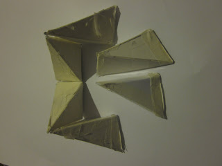
This was my first prototype with a rough pattern on it that I made up. The peieces all connect together so that they fold up into a cube and back out to the large shape. I first made this model out of paper and cellotape which was really flimsy. In the studio we talked about what other materials I could use. I wanted to try wood but I thought because of the shapes it would be too difficult to make sure they fitted together properly and also the cellotape acts as a hinge between the pieces but with wood it would be much more difficult.
This was the first black and white pattern that I tried however I like the effect it has on the object and that the way the lines are drawn keep to the triangle shaped effect.
....
After the circles I moved on to triangles and was wanting to connect them in a way that they would all fold up, I found various sorts of things on japanese origami websites and cut the shapes out of paper and joined them together.
object development
I tried to experiment with different shapes. I used to make these sorts of things when I was younger. The photos above are failed attempts to make a circle shaped folding object. I measures it wrong however but didn't really like the idea enough to continue and make it properly. I felt that with this shape when I held it in my hand it didn't really feel like anything special and i wasn't tempted to play with it.
The pattern could have been quite nice to try on it but i thought I would try something else.
Shapes
image source : https://blogger.googleusercontent.com/img/b/R29vZ2xl/AVvXsEjNYqgJ8ssTgmr-thNK4p75BksBdnoWXKinyaZhRmVJMdBzX3TwRcg6k4utqZMgzTHE-03-k6G4mI5ph_terb6bF2tQegXrVsw1fUIBXr3bUEOxC3RM3kXwMUp6nWzYd88peFwackM8X-I/s1600/Platonic+Solids+Christmas+Lights+Papercraft.jpg
patterns...
I am definitely preferring the plain black and white patterns to the coloured ones as I think this will make it easier to concentrate on the pattern itself rather than the colours. I like how simple the top image is and how the lines are drawn the image pulls you in, this is a similar effect I am hoping to create with my model.
image source:http://images.kaneva.com/filestore4/3453496/4037198/focus_pattern300dpi.gif
patterns..
1.
2.
These are the types of patterns that I myself are attracted to however I feel that with the object I am wanting to create these will be to ornate and confusing and so it would be better to perhaps go with something more linear and clear cut. I do like the use of the colours in these 2 patterns aswell.
image source: 1.http://obeygiant.com/images/2010/02/Obey-ornate-pattern-18x18blk-500x500.jpg
2.http://www.patternsshop.com/wp-content/themes/EmptyCanvas/slider/celebration_floral_vector_pattern.jpg
..
I also found information on something called pattern therapy which is when certain shapes, proportions and positions are used to positively influence well being. I don't know how legitmate this therapy is however I want to use pattern in this way my creating a soothing or almost hynotising object that captures peoples attention. I want to look into colour and also at different patterns to see what sort of shapes I find most appealing.
development
image source: http://babystrology.com/_img/infant_visual_stimulation.gif
Subscribe to:
Comments (Atom)


